
Lupo
Client
Branding
Services
2018
LUPO is a traditional Italian gelateria located in Tlalpan, Mexico City. It’s the kind of place where time slows down and ice cream feels like a family ritual.
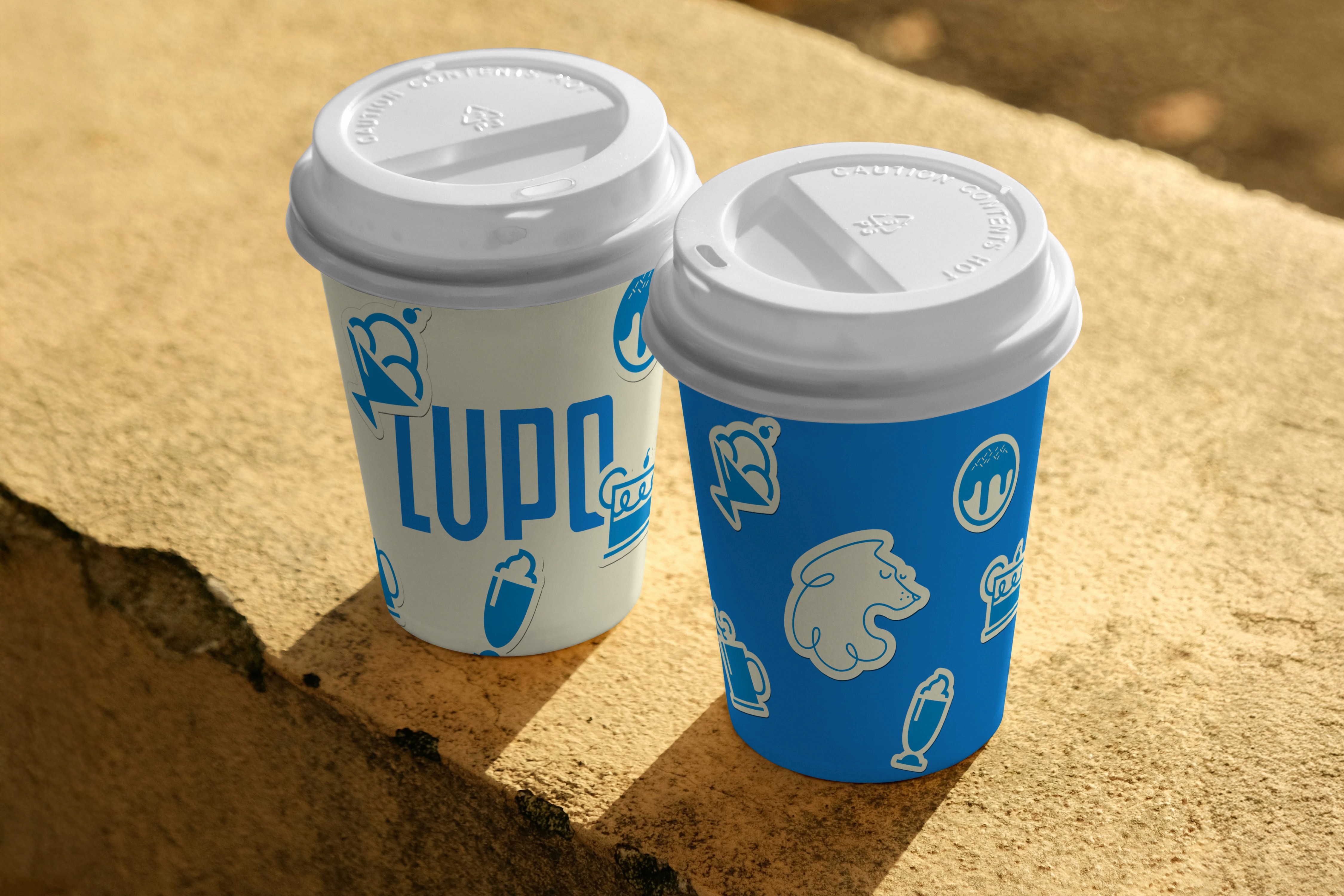
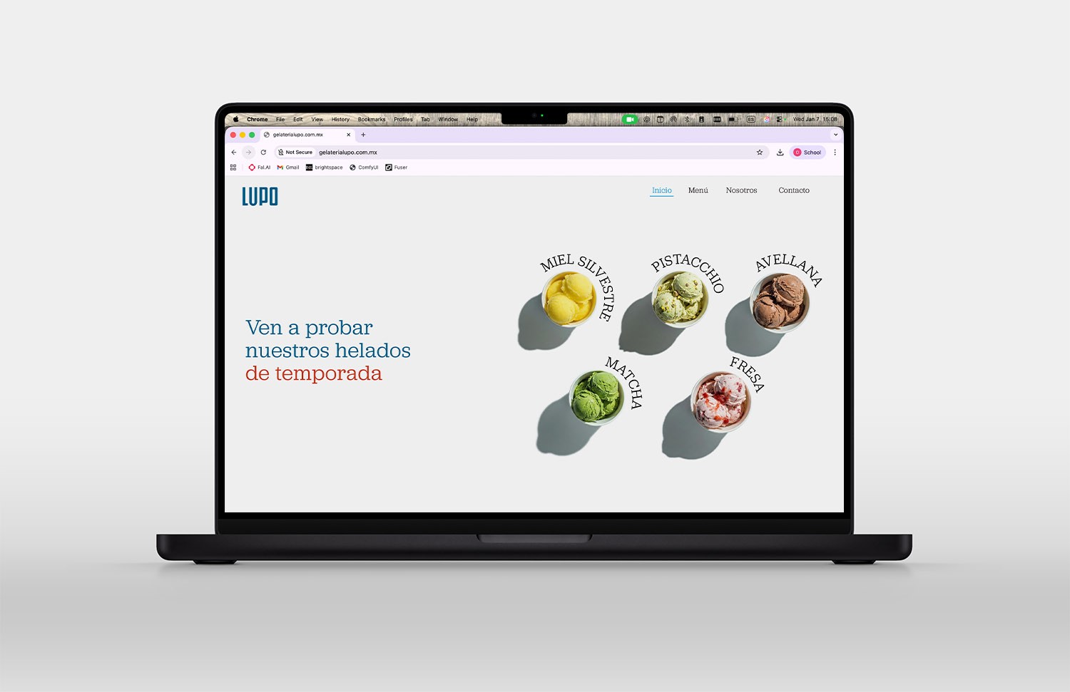

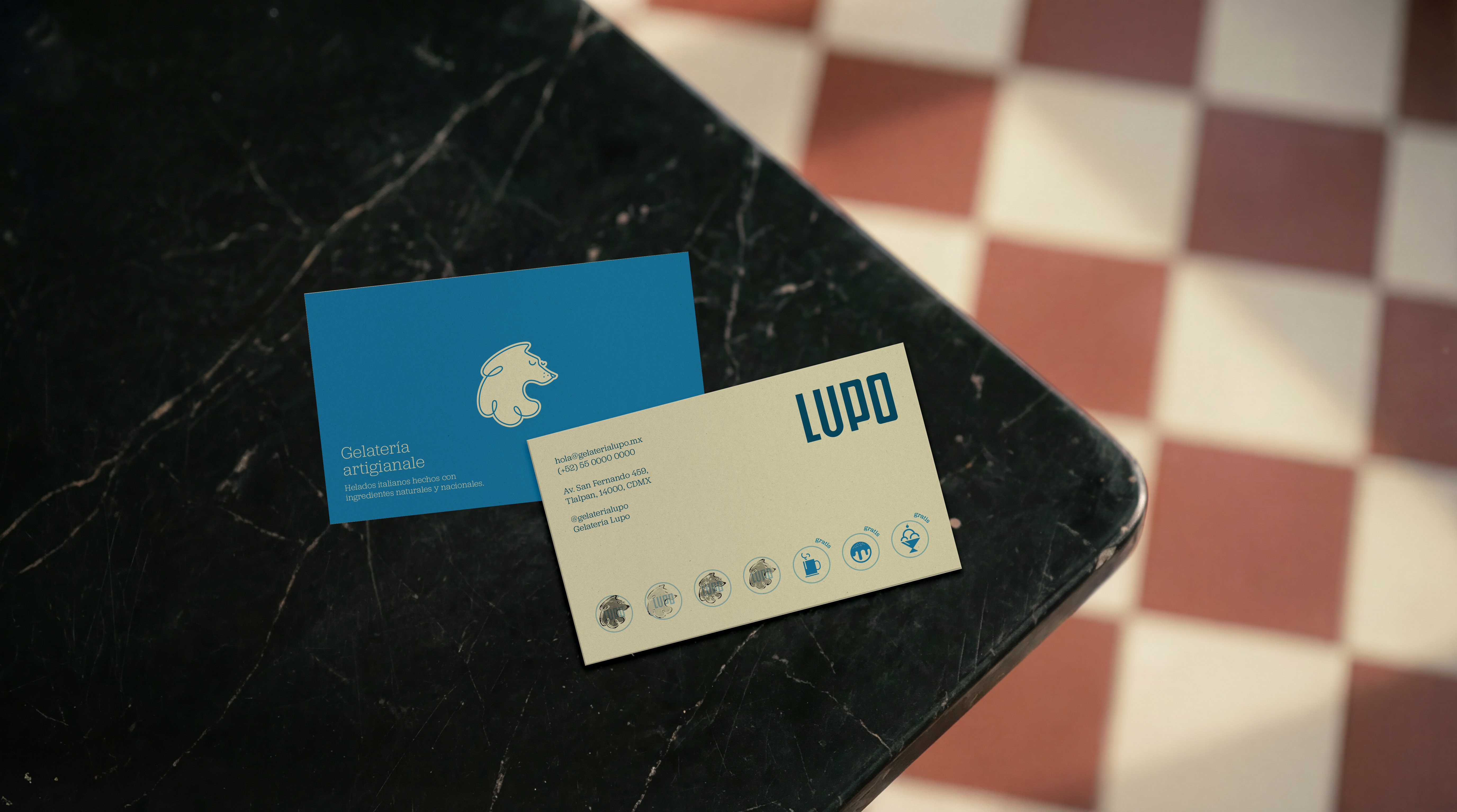
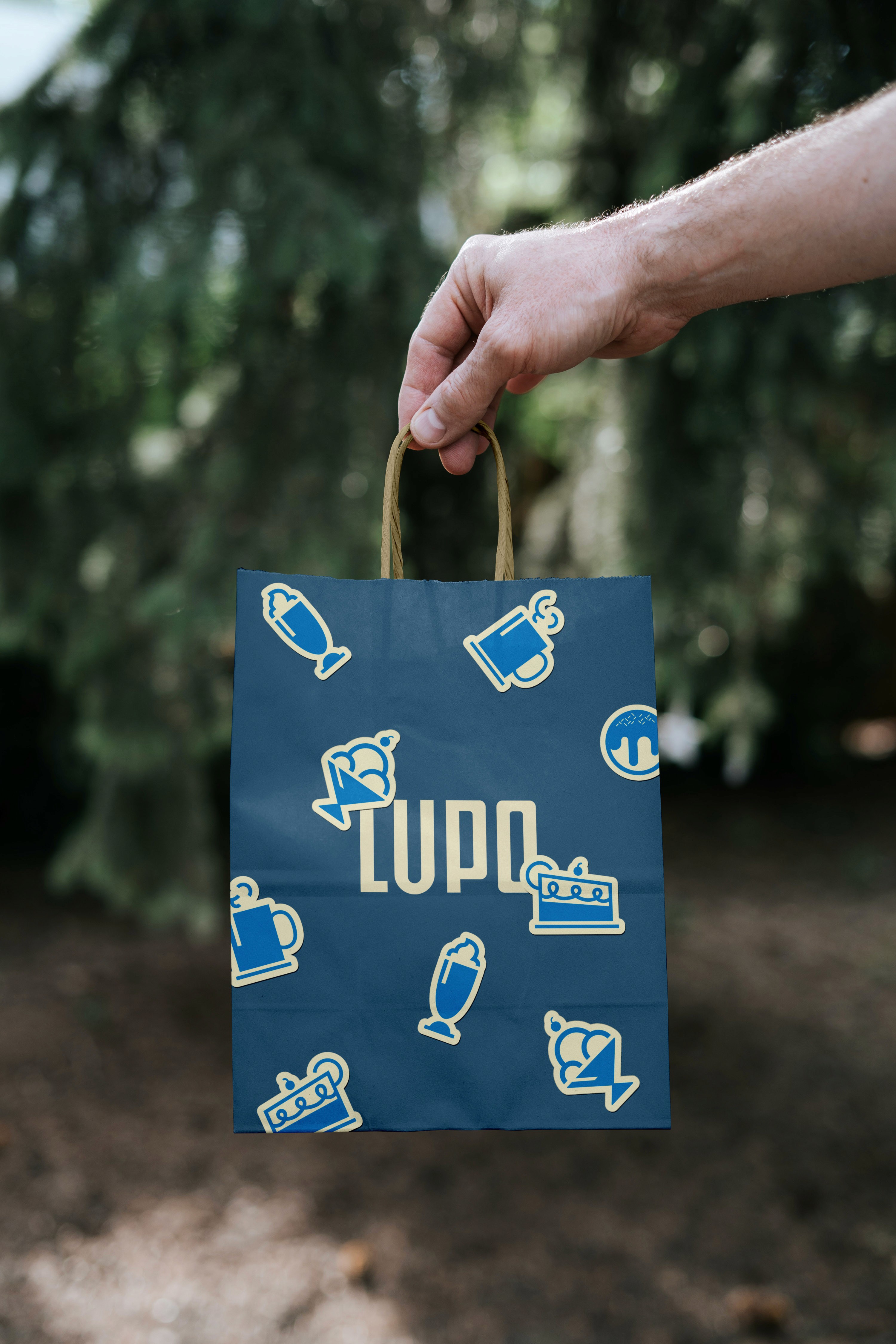
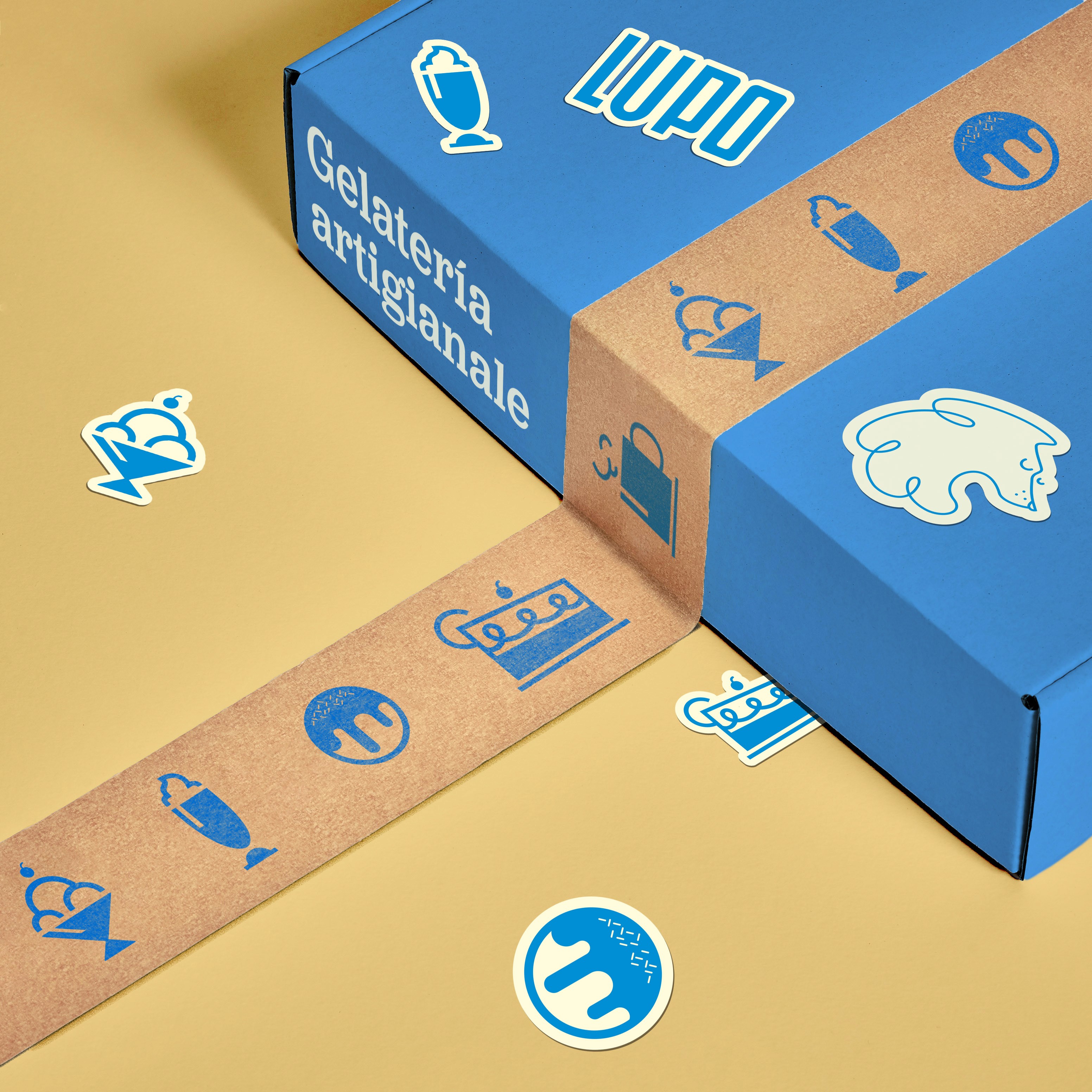
This project focused on crafting an identity that feels like a hug: soft, nostalgic, and familiar. LUPO’s name and logo are rooted in the founders’ Italian heritage—the wolf, Italy’s national animal, becomes a warm and approachable character that welcomes all. Drawn with a single scribbled stroke, the wolf adapts its expression (from sleepy to excited) creating a playful and dynamic system. The branding balances the charm of artisanal gelato with a contemporary twist: a custom-drawn logo, hand-made typography, and a family of pictograms that reflect the friendly spirit of the space. The visual language—organic lines, soft tones, and a conversational voice—invites people to slow down, grab a gelato, a coffee, maybe a croissant, and enjoy the kind of Sunday you’ll remember years from now.
Client Lupo Year 2018 Services Branding, Art Direction, Packaging Typefaces Adelle, custom-made font Credits Oscar Carrillo (Creative Director) Tools Adobe Illustrator Adobe Photoshop Adobe Indesign Adobe Firefly
More projects